History Visual
Explore the historical attribute values for employees, candidates, requisitions, and more.
Overview
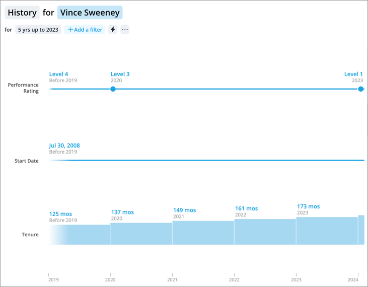
The History visual is a timeline that shows the values for a selected attribute in chronological order. The visual consists of a horizontal line which represents time progressing from left to right. The line is marked with data points (events) to indicate changes to the attribute value. The data points create segments which represent the duration of an event (how long the value remains the same). The length of each segment is proportional to the duration of the event. The longer the segment, the longer the attribute value remained the same. The chart works with numeric attributes (for example, Tenure and Compa Ratio) and categorical attributes (for example, Job Name and Location). For numeric attributes, the height of each segment reflects the magnitude of the attribute value.
The following sections in this topic describe how to use the History visual to analyze the historical attribute values for employees; however, you can also analyze other subjects such as applicants, candidates, and requisitions.
The History visual provides a quick way for you to review the changes to individual employees. For example, the History of Job Name will show you the roles an employee has previously held, how long they spent in each role, and when they started their current role. You can use the History visual to see the impact of your retention strategies on employees. For example, you can look at the History of Risk of Exit for Employee A to determine if the raise and promotion that you gave to Employee A has impacted their willingness to stay at your organization. You can also look at the history of a single attribute across multiple employees for comparison.
Note:
- The visual shows the attribute value as of the beginning of each period. Be careful when using the visual to validate your data because the changes in value are not shown precisely when they occurred. For more information, see How does the selected time granularity determine what attribute changes are included?
- You cannot use the chart to validate prediction data such as an employee's Risk of Exit. For more information on how to measure the accuracy of Visier's predictions see, Validate Predictions Against Actuals.
How to access the History visual
The History visual can be accessed from the Compare room, the Detailed View visual, and the Members section in the Insights tab of the Info panel. For more information, see Compare and Detailed View Visual.
With this visual, you can view the history of:
- A single attribute for an employee.
- Multiple attributes for an employee.
- A single attribute across multiple employees.
To view the history of a single attribute for an employee:
| In | Do this |
|---|---|
| Detailed View visual |
|
| Compare room |
|
To view the history of multiple attributes for an employee:
| In | Do this |
|---|---|
| Detailed View visual |
|
| Compare room |
|
| Members section |
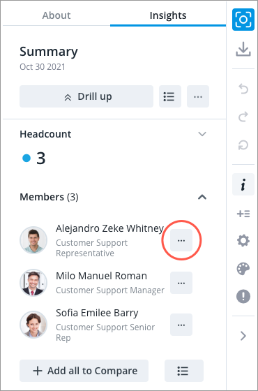
If your data point has five or fewer members in the population, you can quickly access the History visual from the Members section in the Insights tab of the Info panel.
Note: For the Members section to appear, the following criteria must be met:
|
To view the history of a single attribute across multiple employees:
- In Compare room, add the employees you want to analyze to the comparison grid.
- Select the attribute you want to view history for.
- In the Insights tab of the Info panel, click View history.
How to explore the visual to gain insight
- Use the Time picker to change the time period or granularity to reveal additional changes to the attribute.
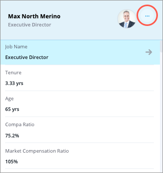
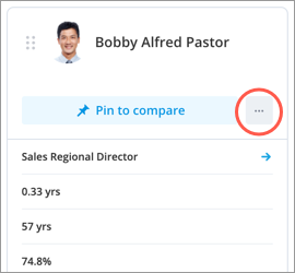
- Explore data points of interest and view a summary of the data in the Info panel.
- Navigate between data points that are close together by clicking the left and right buttons at the top of the Info panel or pressing the Left and Right Arrow keys on your keyboard.
- Add or remove attributes by clicking the Settings button
 . For more information, see Customize an Attribute Set.
Hide values from the History visual
Zeros, null (N/A), and unchanged values can clutter the visual with unnecessary noise. To ensure the most relevant data is presented and to make your visual easier to understand, you can hide these values in the Chart Settings panel.
Note: Subject members will automatically be hidden from the visual when both the following conditions are met:
- There is no data for the subject for the selected time period.
- At least one of the options (zeros, N/A values, or unchanged values) is toggled off.
-
Click the Settings button
on the Visual Actions menu. - In the Chart Settings panel, select the values you want to show or hide in the visual by clicking the corresponding toggles. Use the following information as guidance to determine what happens when you turn the toggle off and hide these values.
Use the following information as guidance to determine what happens when a specific toggle is off and the values are hidden:
Comparing multiple attributes for a subject member such as an employee
- Show zeros is off: Attributes that have the value of 0 throughout the selected time period will be hidden from the visual.
- Show N/A is off: Attributes that have no data throughout the selected time period will be hidden from the visual. This includes attributes that you don't have detailed data access to.
- Show unchanged values is off: Attributes that have a constant value throughout the selected time period will be hidden from the visual, except when the subject member's status has changed during the selected period.
Comparing a single attribute across multiple subject members such as a group of employees
- Show zeros is off: Subject members that have the attribute value of 0 throughout the selected time period will be hidden from the visual.
- Show N/A is off: Subject members that have the attribute value of N/A throughout the selected time period will be hidden from the visual.
- Show unchanged values is off: Subject members that have a constant attribute value or status throughout the selected time period will be hidden from the visual.
Frequently asked questions
How does the selected time granularity determine what attribute changes are included?
The selected time granularity determines when the data is analyzed for changes. The attribute values at the beginning of each period are compared to determine if a change has occurred.
To illustrate this let's look at the changes to Jane Ives' Compa Ratio:
| Date | Compa Ratio |
|---|---|
| January 1, 2018 | 65% |
| March 4, 2018 | 94% |
| April 10, 2018 | 100% |
| June 15, 2018 | 109% |
| August 23, 2018 | 131% |
The changes that are included in the History visual will depend on the time granularity you've selected. Let's say, you want to visualize this data at a quarterly granularity for 2018, then the attribute will be analyzed at the beginning of each quarter. If there is a difference in value, the change will be included in the visual as a data point. The data point will show the attribute value at the beginning of the period, as shown in the following illustration.
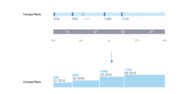
This means short-lived changes may not be included. In this example, the Compa Ratio changes multiple times in Quarter 2 (April 10 and June 15). The change on April 10 is not included in the visual because when the data is analyzed at the beginning of Quarter 3, the Compa Ratio has a value of 109%. You can see more detailed changes in the visual if you view the data at a more granular level (monthly).
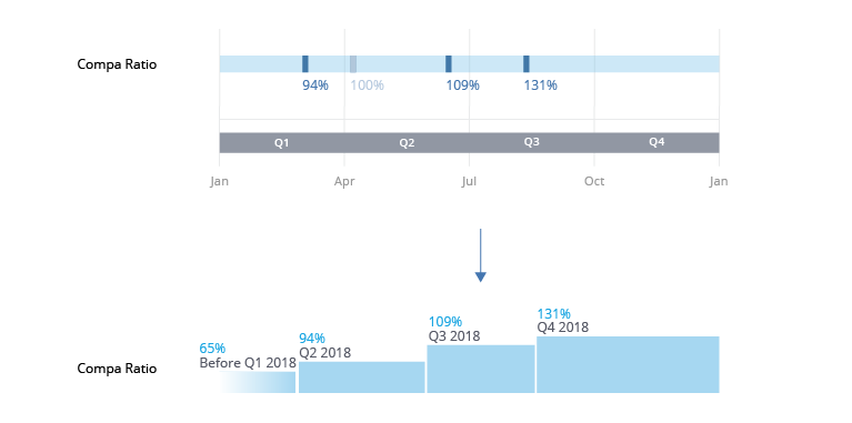
The data is also analyzed the moment before the selected time window begins and at the end of your selected time window.
Data analyzed the moment before the selected time window begins
If there is no change in value at the start of the selected time window, the visual will include a before value as a data point. The data point represents the attribute value right before the start of the time window. Building off the preceding example, let's say the first change to Jane's Compa Ratio in the selected time window of 2018 happens in March instead of January 1, 2018.
| Date | Compa Ratio |
|---|---|
| November 21, 2017 | 65% |
| March 4, 2018 | 94% |
| April 10, 2018 | 100% |
| June 15, 2018 | 109% |
| August 23, 2018 | 131% |
When the data is analyzed the moment before the start of the selected time window (December 31, 2017), the attribute value is compared to the value at the beginning of the selected time window (January 1, 2018). Since there is no change in value, the before value will be included as a data point. As shown in the following illustration, the first data point in the visual is Before Q1 2018, the Compa Ratio value right before the start of the selected time window.
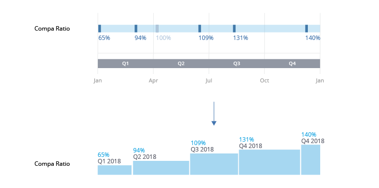
Data analyzed at the end of the selected time window
If there is a difference in value at the end of the selected time window, the change will be included in the visual as a data point. The data point represents the attribute value at the end of the period. Building off the preceding example, let's say there was another change to Jane's Compa Ratio in Quarter 4, the last period of the selected time window.
| Date | Compa Ratio |
|---|---|
| January 1, 2018 | 65% |
| March 4, 2018 | 94% |
| April 10, 2018 | 100% |
| June 15, 2018 | 109% |
| August 23, 2018 | 131% |
| December 25, 2018 | 140% |
When the data is analyzed at the end of Quarter 4 (December 31), the attribute value is compared to the value at the beginning of the quarter (October 1). Since there is a difference between these two values, an additional change is detected and included in the visual as a data point. As shown in the following illustration, the visual includes two data points for Quarter 4. The last data point in the visual is the Compa Ratio value at the end of the period.
Why do I see gaps in the chart?
Gaps in the chart appear because there is no data available for the attribute for the employee during the selected time period. Let's say Employee B left the organization in February 2016 and rejoined in March 2018. If you look at the History of Job Name for Employee B, you will see a gap in the chart from February 2016 to March 2018 because there is no data available for the employee as they were not part of the organization.
How does data access affect what you see in the visual?
As long as you have data access to the employee, you'll have access to their historical data. Let's say you have data access to the Sales team and Aaron Soto moves to the team in May 2018, you'll see all changes to their attributes, including changes that occurred before May 2018. Similarly, if an employee moves out of your security context, you get access to their historical data until the move. If Aaron moves out of the Sales team in March 2020, you'll see all changes to their attribute values up until March 2020. Gaps only appear in the visual when there is no data available.
Note: The described behavior may differ if Advanced Historical Analysis is enabled. For more information, see Data and Content Security.
Why do I see gray segments in the chart?
Gray segments indicate periods where the employee has an inactive status. Let's say Employee E had a leave of absence from July 2017 to August 2018. During this time, Employee E was marked as an inactive employee so they aren't included in the headcount. If you look at any historical attribute values for Employee E, you will see a gray segment in the chart from July 2017 to August 2018.
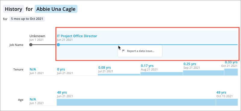
How do I report data issues to an administrator?
Access requirements
Permission with these capabilities: Flag and Fix
Reach out to your administrator for access.
For more information about this workflow, see Report a Data Issue.
To report a data issue for a simple attribute:
-
Right-click the attribute value you want to report and then click Report a data issue.